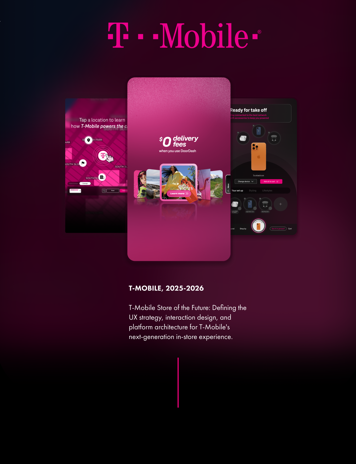
Project Overview
PROBLEM
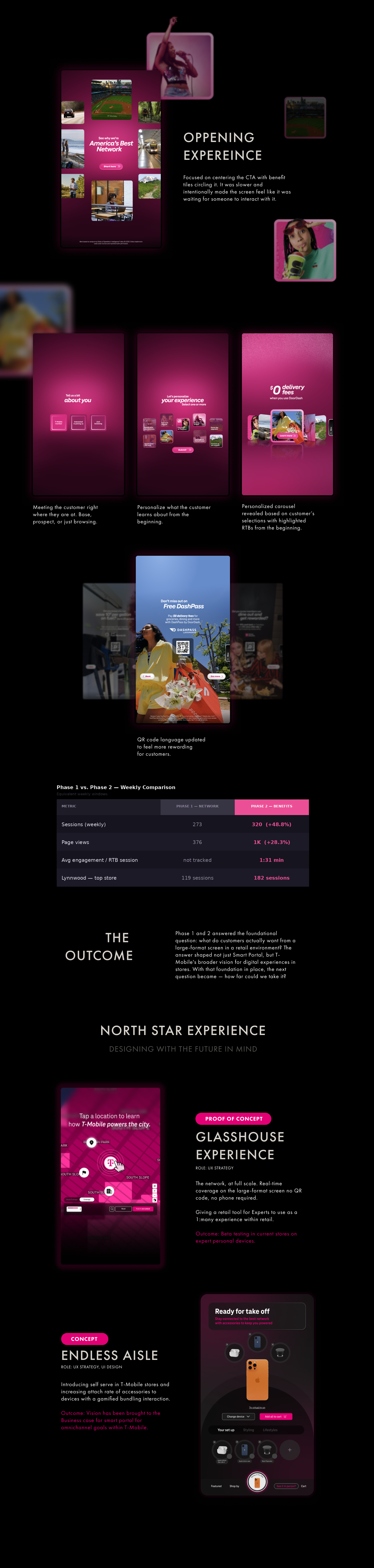
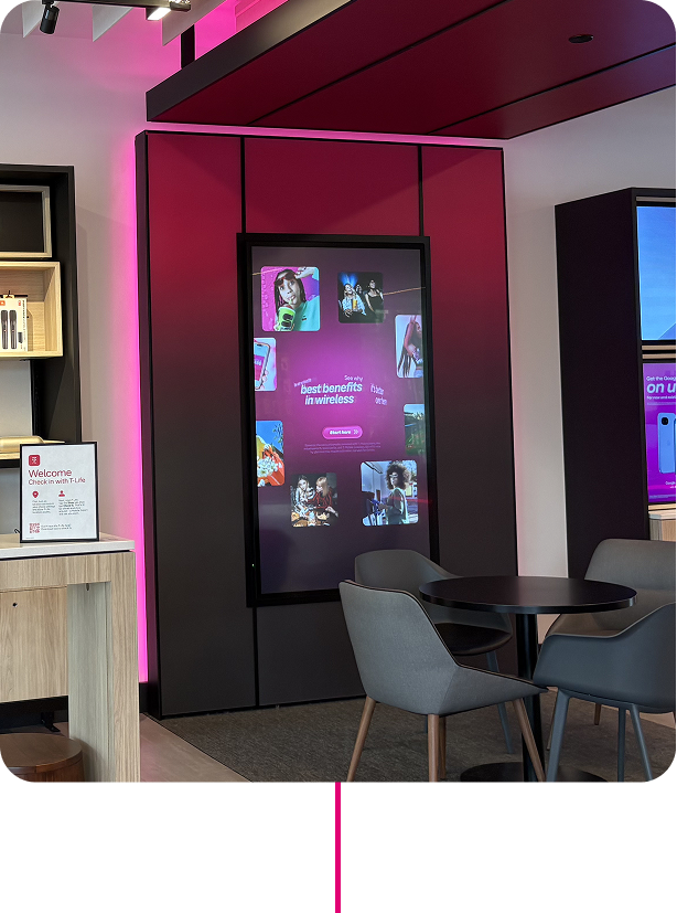
T-Mobile had a large-format screen in store with no clear strategy for what it should be. The first instinct was visibility — put the network on it and see what happens. But without a clear understanding of how customers interact with screens in a retail environment, it was hard to know what "good" even looked like.
OUTCOME
By the end of two phases we had our answer. Smart Portal's role in the retail store became clear — not a billboard, but a platform built around personalization, utility, and self-service. Customer insights, expert feedback, and behavioral data all pointed to the same thing: customers wanted a screen that felt like it was built for them, could help them without an Expert, and gave them a reason to come back. That clarity became the strategic foundation for everything that came next.
MY ROLE
Senior UX/UI Design
WORK OVERVIEW
UI/UX design, Strategy, Agency Direction
My Push on insights
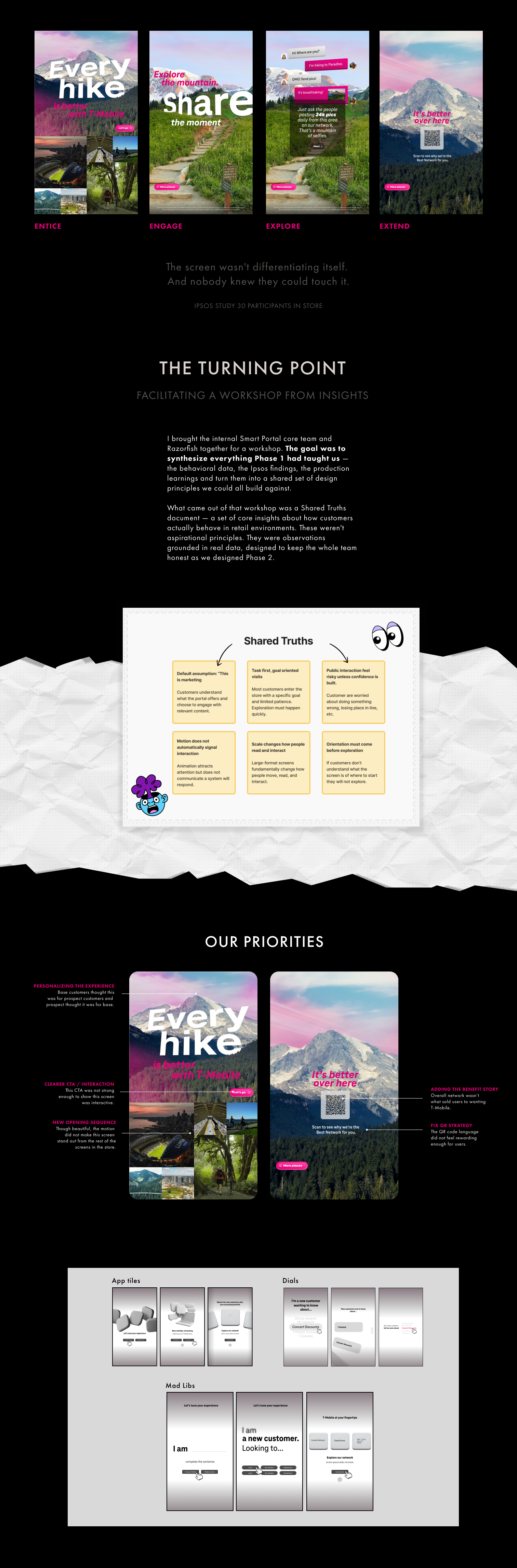
The screen had to feel like more than an ad. Interactivity, surprise, utility and a QR handoff that earned its place by building enough curiosity first. Those principles survived even when the execution had to change. I focused on a journey of:
Entice → Engage → Explore → Extend.
Redesigning
the experience
The biggest UX challenge was the opening screen. Phase 1 dropped customers straight into content with no context. The research was clear: we needed something that asked who they were before showing them anything.
I explored three fundamentally different interaction models — App Tiles, Dials, and Mad Libs — before landing on the direction. The Mad Libs concept came most directly from the Ipsos finding that nobody felt the screen was speaking to them. By asking customers to complete a sentence — 'I am... a new customer. Looking to... switch, and help family, show me' — the screen immediately signals: this is about you, not about T-Mobile.